Netflix ⭒ Ethos
Miami Ad School ⭒ Illustration
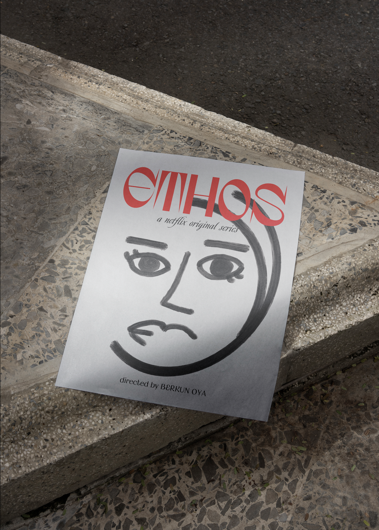
A series of posters for the Netflix series Ethos
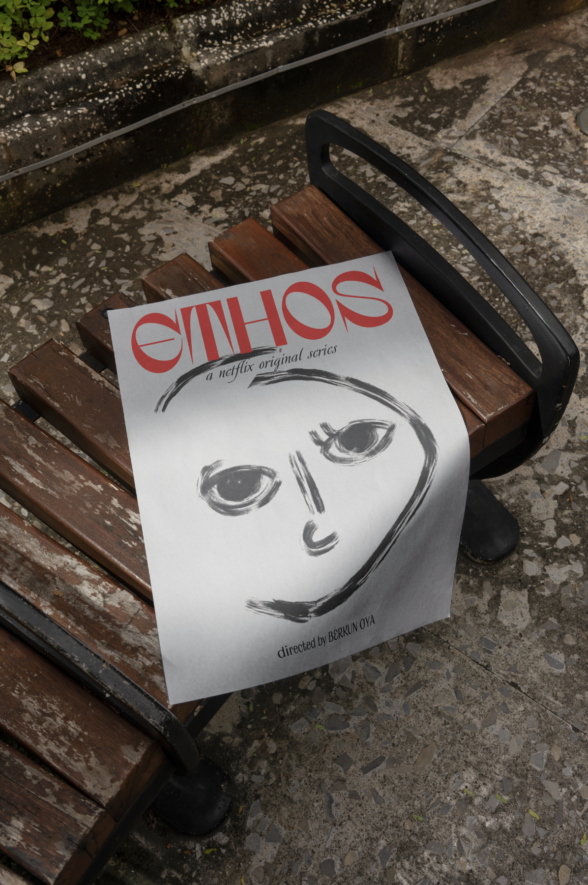
ethos: poster series
-
ethos is a turkish netflix series that explores the relationships between people with different social positions and moral beliefs.
-
although the series reflects the difference, the true beauty is shown in the relationship that each character develops with themselves, it's a journey about facing fears and dealing with your true emotions.
-
in different styles and different faces, this poster series aims to reflect each character's relationship with themselves
Meryem
Cleaning lady who comes from a religious conservative family in the rural outskirts of Istanbul.
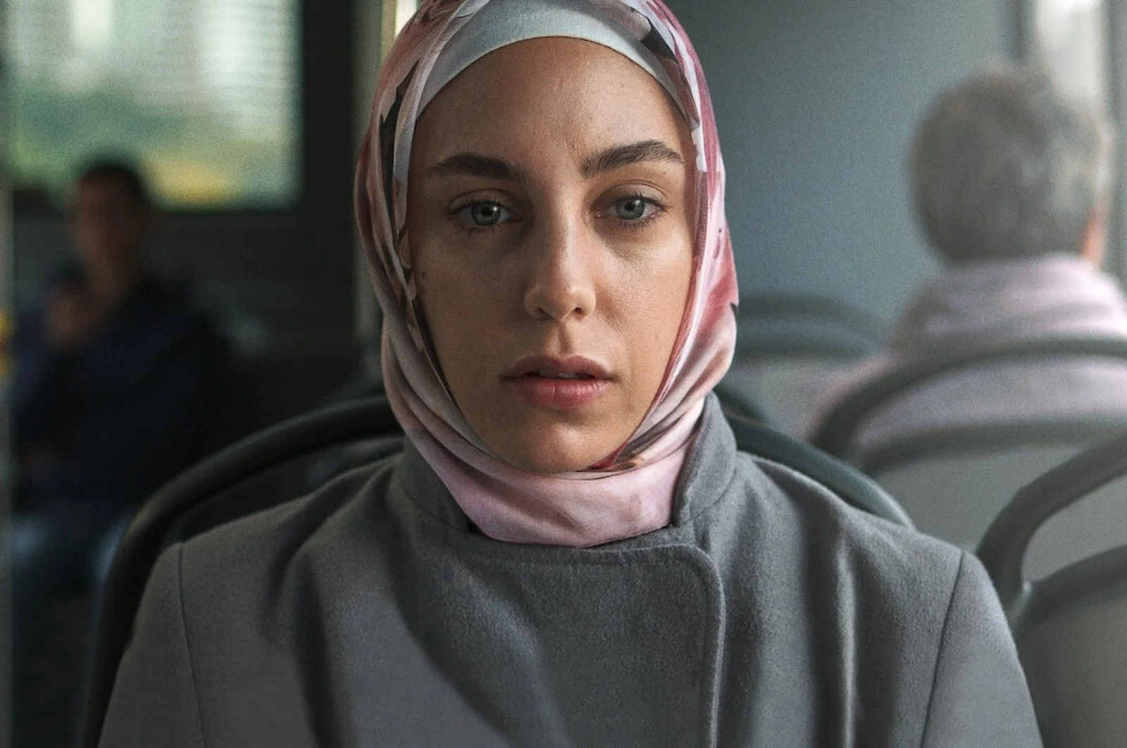
After finding herself often experiencing fainting episodes, she has to see a psychiatrist, even though she doesn't believe in it. They both have opposite lives and beliefs. Although they struggle to understand each other, something draws them together. Meryem doesn't speak much, having repressed many of her feelings. But you can feel the power that lies in her soul through her eyes.
Fatma
Miryam's sister is a housewife in charge of taking care of her kids, but she dreams of having a life outside.
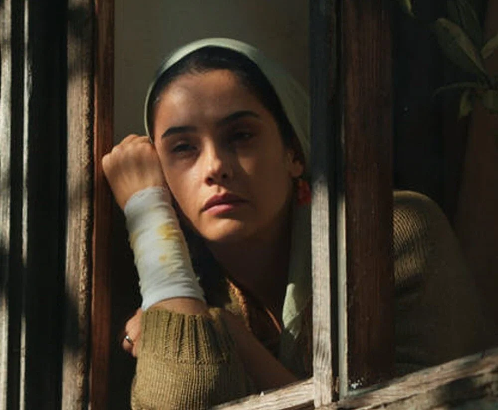
In her eyes, you can see tiredness and wonder. She spends days looking through a window. She never tells what she thinks, but you can see what she dreams.


Design Choices
-
These characters, marked by their minimalistic attire, rarely articulate their emotions, but that doesn't mean they feel any less. Though they may often be at a loss for words, their eyes remain mirrors of their souls, revealing the depth of their unspoken emotions, like a silent scream longing to be heard. "ETHOS" brings a voice to their silence.
-
The poster's black and white palette creates a simple background, mirroring the initial impression of the characters. However, the use of red in the title emphasizes that they have more to say than meets the eye— you have to watch it.
-
ETHOS: Villanelle
The serif style, with its high contrast between thick and thin strokes, brings a dramatic flair to the text, instilling a sense of tension and anticipation, providing a glimpse of what ETHOS is about. Along with its curved lines, this font choice creates a captivating narrative with elements of storytelling and romance, bringing forth a world of contrasts and emotions.
Subtitle: Avalon
This font was selected for its resemblance to storytelling, thanks to its classic serif style and italic mode, evoking a sense of tradition and narrative charm.
Credits: Calyces Inc
Keeping it simple yet preserving the storytelling charm and tension, Calyces introduces contrast through varying strokes within the same letter, where the interplay between thick and thin subtly creates a narrative effect. All the while, its rounded font style enhances the design with a contemporary feel, inviting friendliness and approachability to the credits.
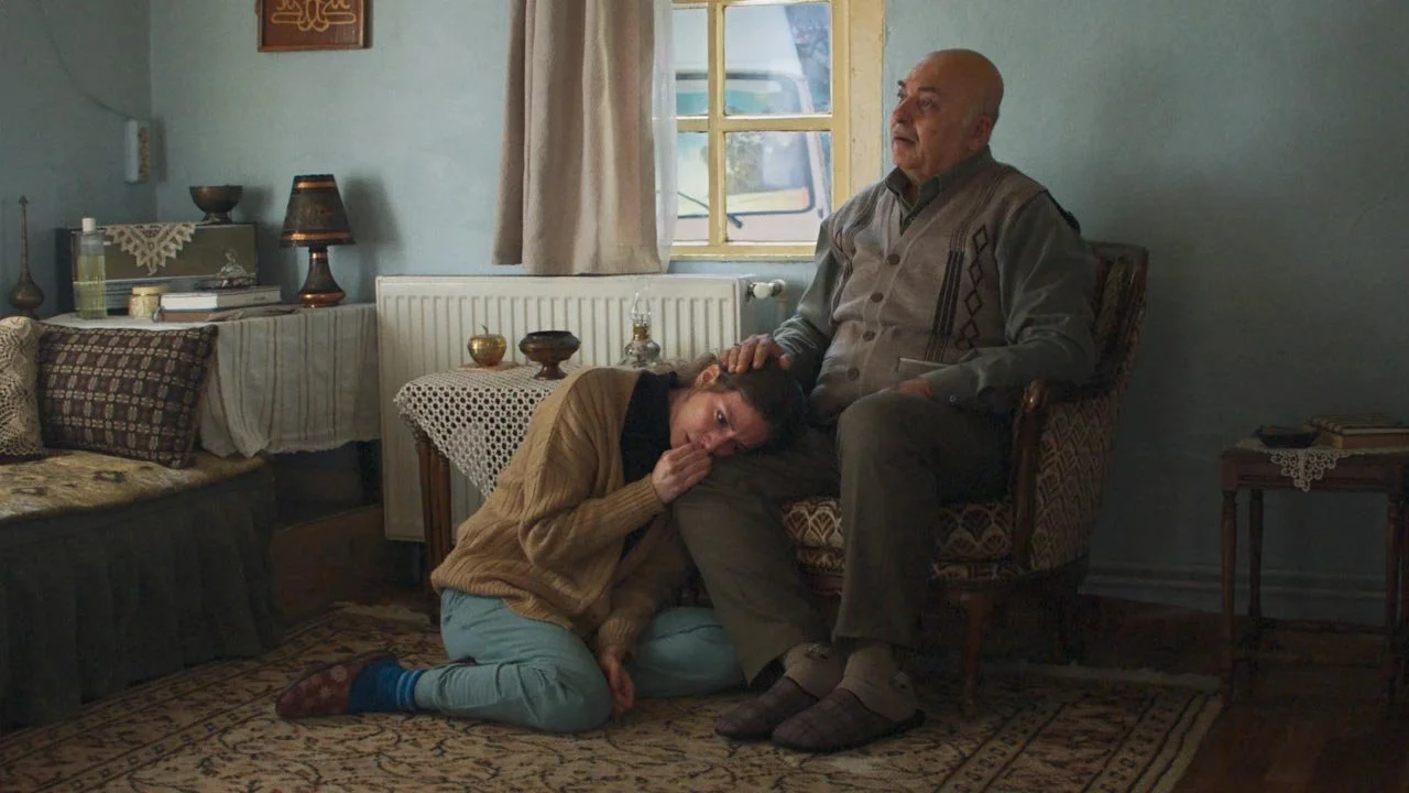
There is love, but there is a fear of losing it. The father fears losing her to life as she's growing up and leaving home for college. The daughter fears losing her father's love due to her choices in her love life. She is a lesbian but not out to her family yet.
Hayrunnisa
Soon-to-be college student, Hayrunnisa is the daughter of the priest, holding a lot of love for her family but also harboring many secrets from them.

Design Choices

-
The father looks at his daughter, while the daughter gazes outside. Her gaze, uncertain and filled with wonder, reaches out to us, encapsulating a complex blend of emotions. Her position seems comfortable, yet her eyes show fear and wonder. She's unsure about her choices, torn between her desire for independence and her fear of disappointing her father.
-
The color scheme, inspired by the first set of posters, replaces white with a warmer background to infuse the poster with a sense of affection. Once it no longer centers on an individual but portrays a profound father-daughter relationship, the daughter's lilac color represents innocence yet a transformation with femininity. The backdrop of blue behind the father symbolizes the sanctity he, as a priest, embodies.
-
Title: Calyces
It's variations in stroke thickness within the same letter, even if the contrast is subtle, can convey a storytelling effect by adding visual interest and dynamism to the text, matching the series' tension. Different from the previous posters, in the context of this one, the choice of a rounded font not only brings a friendly and approachable vibe but also imparts a sense of softness, contributing to a warm and inviting visual tone that resonates with the poster's illustration.
Credits: Gurmukhi MN
As the credits are in the middle of the illustration, they had to match it but also not get in its way. So, this choice of font was thought to give a modern and discrete look with its sans serif and medium-weight strokes, being neutral and versatile, but still charming.